Accountable for the visual design, brand alignment, and the creation of a flexible templating system in the Greater Twin Cities United Way’s website overhaul. Ensured flexibility within their CMS, empowering the client to seamlessly generate content and drive positive change in the community. Our goal was to build a new website that expanded the brand to a digital space as well as making it easier for users to donate to the United Way.
United Way’s positive impact in the Twin Cities
Greater Twin Cities United Way, a transformative force, aims for a community where all thrive regardless of income or place. Through leadership, impactful initiatives, and advocacy, they address homelessness, enhance education, and promote economic opportunities, fostering lasting change. They came to our company to bring their new brand to life online with a new website driven by a CMS.
My role
As Lead Visual Designer, my job was to design a beautiful and modern experience, ensure brand alignment, and design the visual system in a way that it could be leveraged in multiple ways across the site. Throughout the project, I had to collaborate with our other UX Lead to ensure we’re aligned on the direction of the components and site structure, as well as meet with stakeholders and drive alignment on direction for all facets of the project.
Design discovery
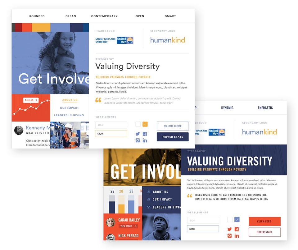
The client had an existing brand as well as their new brand, so the goal was to try and merge the gap between the two since much of their printed materials and other collateral still maintained the old brand. I decided to lead with style tiles for visual discovery since I had a pretty decent idea of what the visuals could be based on the existing elements from the client. Our directions focused on leading with the old brand vs the new and vice versa.
With the style tiles, I wanted to give a different flavor focusing on bolder typography vs a more elegant aesthetic that was softer. For color and imagery, the bolder versions were more conducive to blocks of color and stronger calls to action. Both concepts had a good balance of whitespace. I used adjectives to describe the two concepts and help the client understand what they were conveying.
The client ended up picking the lighter, more contemporary version which was more in line with their new brand, but said they liked both directions.
Initial concepts
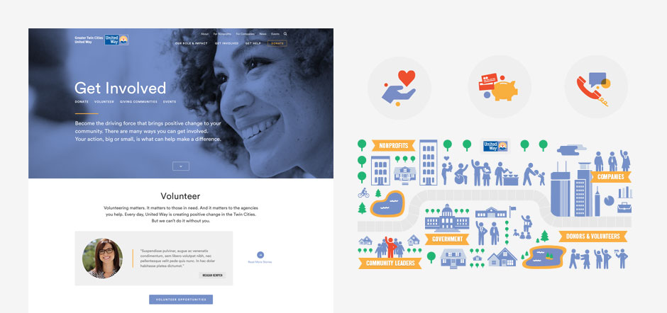
Since the client had strong agreement on the direction based on the style tiles, we were able to jump into design concepts with a strong level of confidence which resulted in extremely minimal design revisions.
Using the in-progress wireframes as the foundation, I chose a page for mockup creation that showcased the most variety of components and consistent layout that would use the design elements prevalent across the entire site. In addition, visual and illustrative assets were very minimal, so I worked with our UX Designer to create illustrations that could be used across the site in key pages and modules.
Design execution
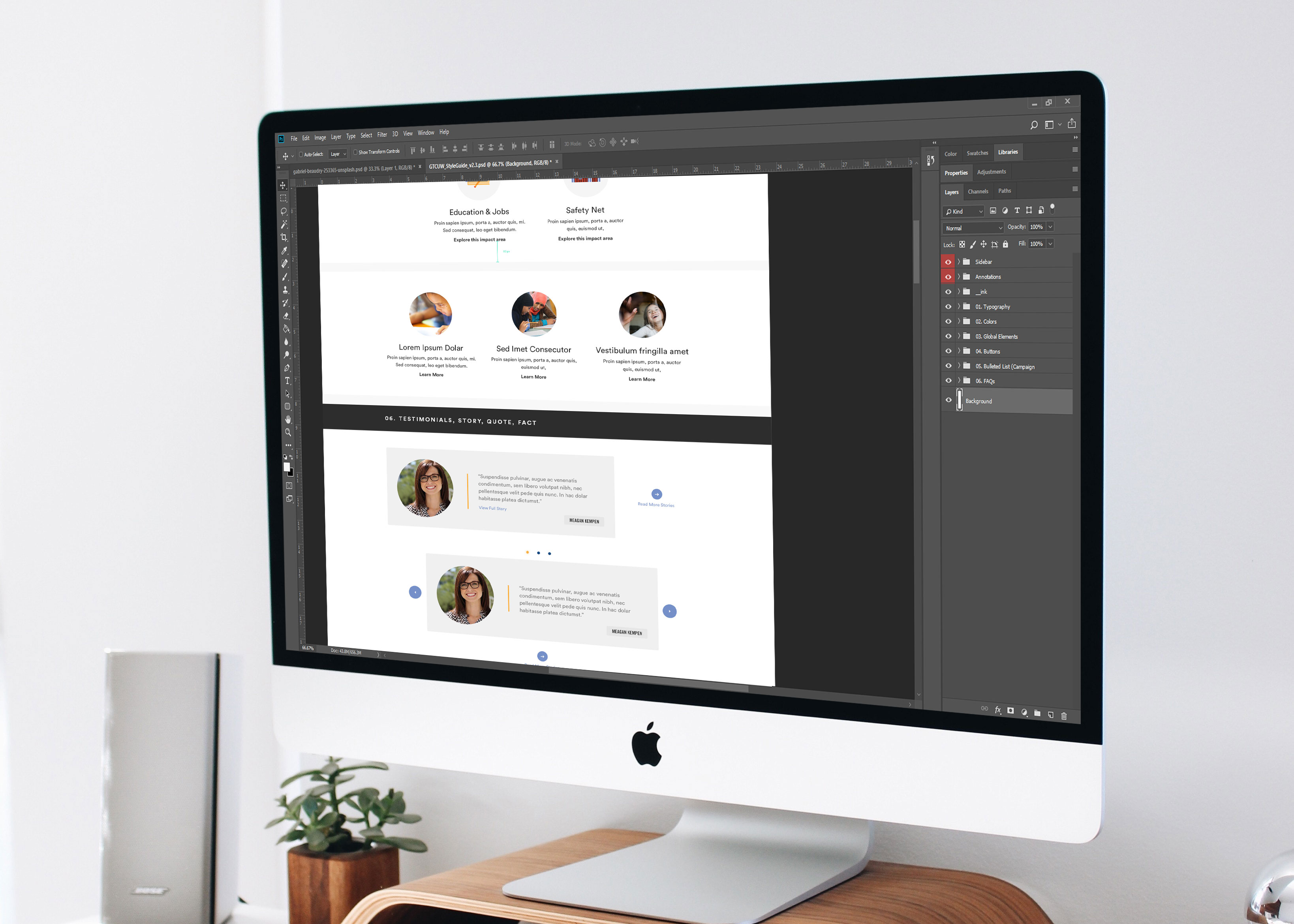
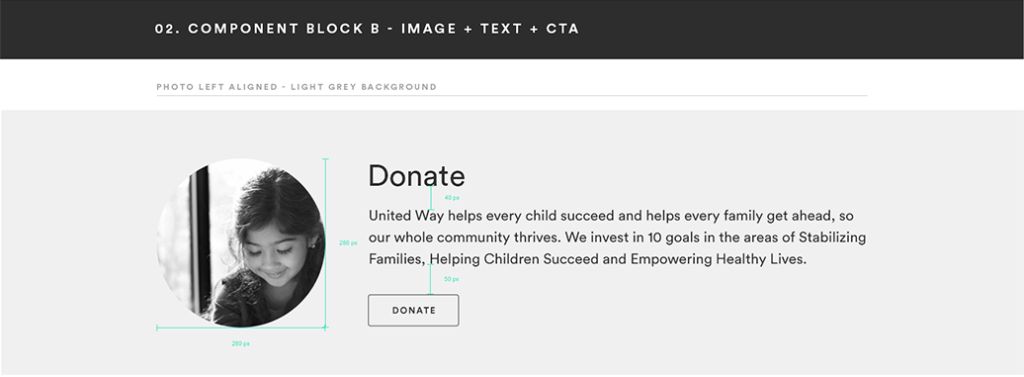
The style guide and pattern library I created was designed to be flexible so the client could create their own pages with a variety of modular components. Our development team took on the task of making a large variety of modular components, mirroring the entirety of the visual design. The library allowed them to mix and match pieces and create pages that felt fully designed within their CMS.


Impact
Our success in the Greater Twin Cities United Way’s website overhaul lied in close collaboration with internal design and engineering teams, and transparent ongoing collaboration with our clients to create an impactful and flexible web presence. The beautiful design and organization not only streamlined operations but also contributed to ongoing positive change in the community, marking our enduring impact on the Greater Twin Cities United Way’s digital presence.
