I was brought into the project early on for my strengths in visual design and motion design as well as proven track record with other projects at our agency. My goal was to come in and drive the design of a fresh, modern experience that we could all be proud of and would delight our users on both mobile and desktop experiences.
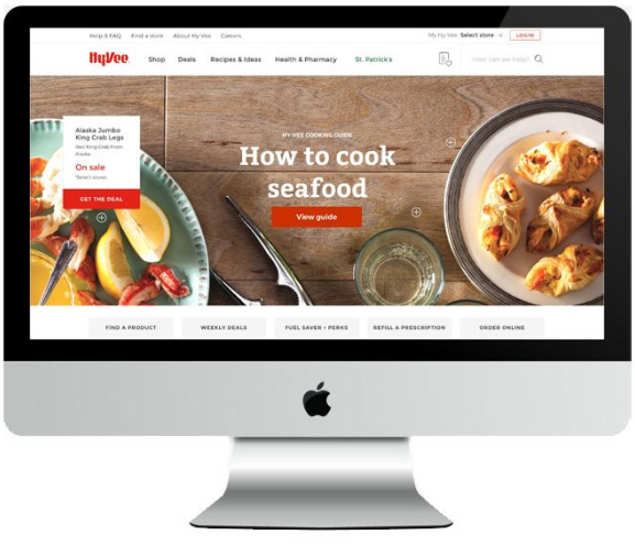
Bringing a historic brand in grocery into the modern web era
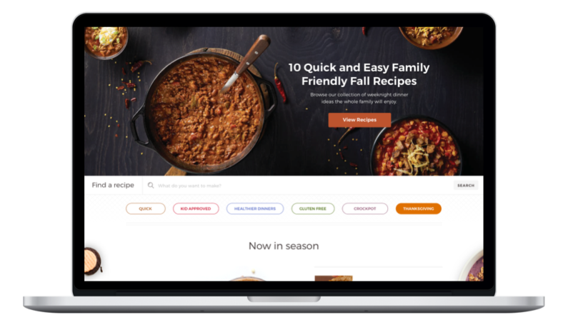
In aligning with Hy-Vee’s strategic vision, our team set out to revitalize the hy-vee.com website. One of our main focuses was on highlighting Hy-Vee’s culinary expertise which was previously showcased only in their print publications. Hy-Vee has over 300 grocery stores across the US, and their brand is very well loved and recognized, making it a unique design challenge to bring a new online presence to a historic brand. We had a large team of designers and engineers working in tandem through the whole process. It was an awesome opportunity for all of us to lead with our strengths and create something special.
My role in the project
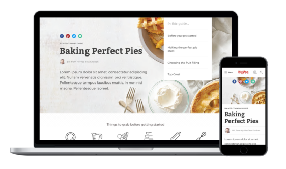
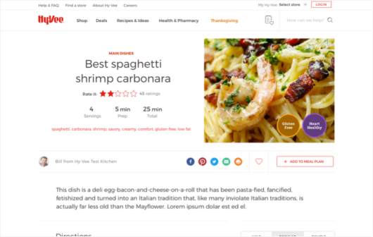
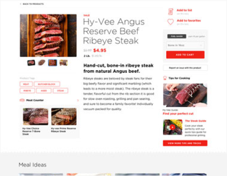
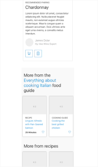
I was pulled into the project to lead the visual design efforts, but I also supported in other tasks like wireframing and prototyping. My starting point was designing the Culinary experience which we felt was the most visual area of the site and would allow us to create the most patterns that could be leveraged elsewhere. Culinary was all about bringing Hy-Vee’s decades of recipes and wonderful food photography online, while also creating strong tie ins with their online grocery service. I worked extensively with my team to meticulously design every aspect of the visual design from the fonts to the colors, to how we used photography and motion. Additionally, I was central in ensuring the designers we brought into the project were able to support with any production work we needed as the project went on. This meant ensuring designers had clearly defined tasks, and didn’t work over each other in a very big project.
Honing the aesthetic direction
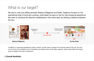
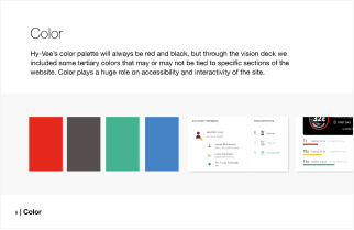
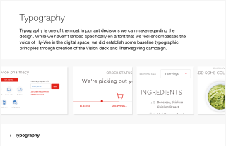
When I started the project, I had a blank canvas to survey Hy-Vee’s entire identity, both in store and in print. Knowing that we wanted to elevate our status in food and recipes online, we conducted extensive competitive analysis, drawing inspiration from the best in breed experiences for finding recipes online. With that, I was able to begin to pull together the beginning conceptual directions that would drive the aesthetic of the site.
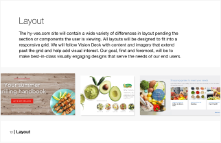
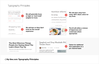
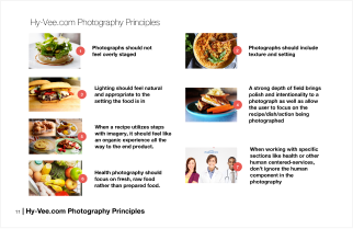
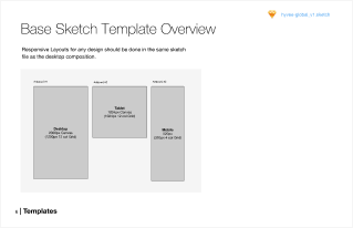
A big part of my job was to help oversee our design team and the visual production work that was being done across multiple channels, and ensure it was folded it into a cohesive visual identity that could be leveraged not only during the project, but for years to come as Hy-Vee continued to create content. The samples below are from a creative direction presentation I gave to our key stakeholders at Hy-Vee in order to ensure we had alignment on direction and create a runway to move forward with design.
Creating a system for collaboration
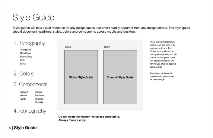
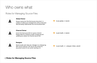
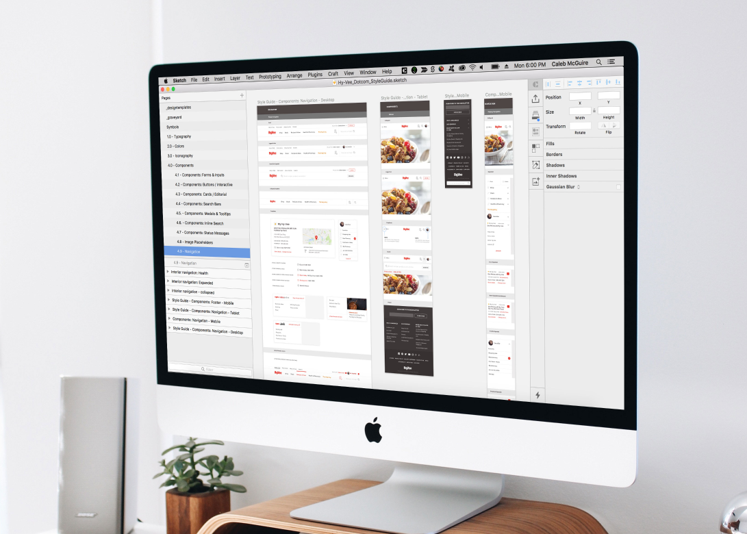
We were trying to push the envelope of collaboration with our project, leveraging Github as a way of version control since there wasn’t a good way to do it at the time. I set up a framework that outlined the different style guides and ways we should manage the huge amount of visual assets we were generating every day. In the example below, our Culinary project is only one channel of a global project that included pharmacy, deals and other sections of the experience. The process I created and attention to detail allowed us to pull in other designers extremely quickly.
Desktop and mobile wireframing
The project was all hands on deck, and even though I was mostly focused on the visual design, I was also involved in working through the wireframes for some of our key pages. Visual design and Interaction design was going in tandem, so this step was really about finalizing both the mobile and desktop designs and then the next step was moving to visual production where we applied our aesthetic direction. It was an awesome experience to be able to design the entirety of these experiences and made the production go much faster given I was already familiar with what we were trying to accomplish.
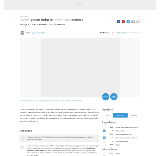
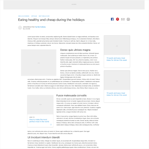
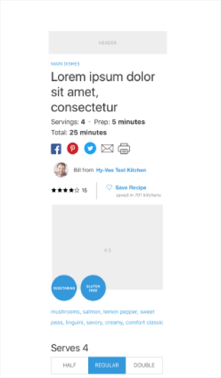
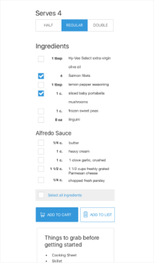
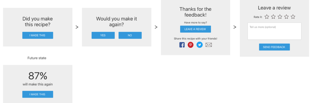
I had to consider some smaller widgets like feedback and social sharing as well as define a tagging system for recipes. Hy-Vee was already leveraging feedback on their old site, and we felt it was a great way to motivate users to interact and provided Hy-Vee a way to improve their recipes and see what was working.
Results & Impact
Heading the visual design for Hy-Vee.com was a gratifying challenge. Our success in achieving our goals can be attributed to effective leadership, emphasizing a positive and collaborative mindset. As a UX leader, orchestrating the project involved not only visual design but also strategic thinking in enhancing user experience, giving constructive criticism and knowing when to make compromises.
Hy-Vee is still using the site we designed and built for them years later today. They get over 6 million hits per month, and it’s been exciting to see how little has changed from our initial designs direction. We worked tirelessly to make something that we all would enjoy using, and that still shows today.
Challenges
- We were pushing the boundaries visual direction, so it was a challenge to get our stakeholders and design team on board with the direction at times.
- We had a massive team of designers and we were continually adding more people. We needed to know everyone’s strengths and feel comfortable leaning into them across the board. If a designer was faster at producing a certain type of deliverable, we had to identify that quickly and set them on a path for success.
- I was the only designer at the company with extensive experience in motion design. This was a really great opportunity and a unique challenge to find areas where we could bring motion and delight into the experience with a more traditional brand.
- Creative direction was hard to get alignment on internally as well. I was leading and art directing, but it all had to roll up to our creative director as well who was looking after multiple disparate projects for the client. We had many sessions where we all poured over printed designs, marked them up, and took them back for revision. It was the biggest production endeavor I’ve ever been a apart of.
- After designing on a project for so long, it was challenging not getting burnt out and keeping ideas fresh. Bringing in new people helped keep our core team energized.