
Making More Attractive Shadows
A different way to think about shadows
I used to think of shadows as these blobs that were always just a faded percentages of black. In reality, shadows change color all of the time based on their different light sources. When we create an object like a button or text, we’re trying to put it in an environment that looks natural which can include creating realistic light and shadows.
When “lighting” an object, I like to start by asking a couple of basic questions: How far off is the light source, and what color would the shadow be given its current environment?

Here is the default shadow Photoshop creates.
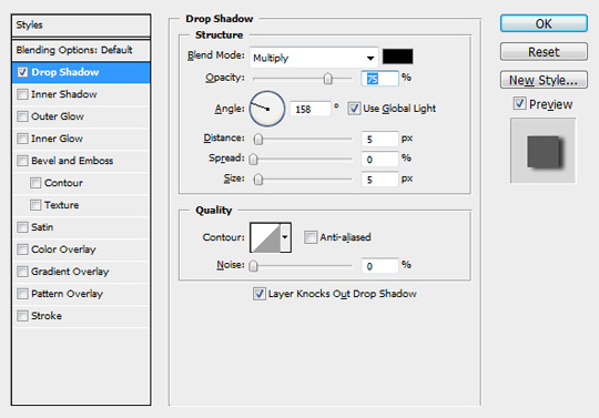

Realism aside, this shadow just doesn’t look all that great to me. To get the type looking more natural, I start by changing the color of the shadow by using Photoshop’s Eyedropper Tool and sampling the background.
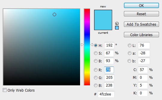

Here is the shadow using the color I grabbed from the top corner of the gradient background. This looks good, but in most other cases, I like to assume there is a little more black in them. Let’s take down the brightness to 35% (adding black) and see how it looks.
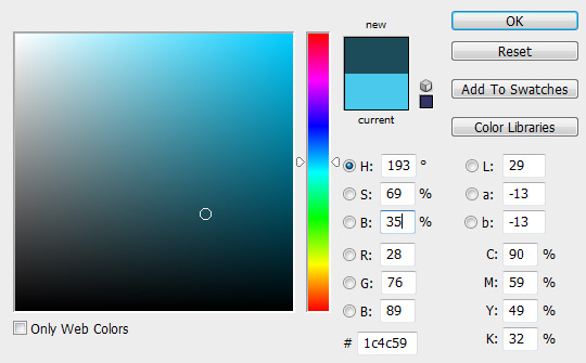

Okay, we have a good blend of black and our base color now, but it’s still a little strong so I’m going to take the opacity down from the default of 75% to 15%.

I know this is a round-about tutorial for something so simple as a shadow, but you’ll be amazed at how your interfaces come to life when you start thinking more about lighting. Here is the code if I wanted to use this drop shadow in CSS:
.fancy {
    font-family: 'MetroScript';
    color: #FFF;
    text-shadow: 2px 2px 3px rgba(28, 76, 89, 0.15);
    }