
Finally… A New Website
Simplicity in design is anything but simple.
Over the years, I envisioned my “dream website”. Not surprisingly, that vision changed quite a few times. I’d see a new design trend and think “Ooo! That’s the one. That’s how I want my site to look and function,” but I wasn’t ever able to get it completed.
When I finally took the time to sit down and build my new website, I wanted it to be simple, attractive and functional. I learned fairly quickly that simplicity in design is still a pretty complicated process.
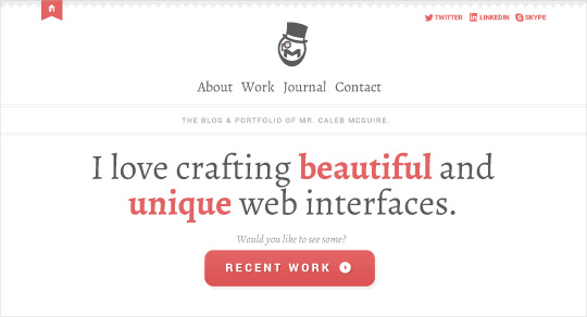
This was my first home page design, and I actually kept quite a bit from it. I liked the diamond shaped trim at the top, the font choices and the overall direction the layout was going.
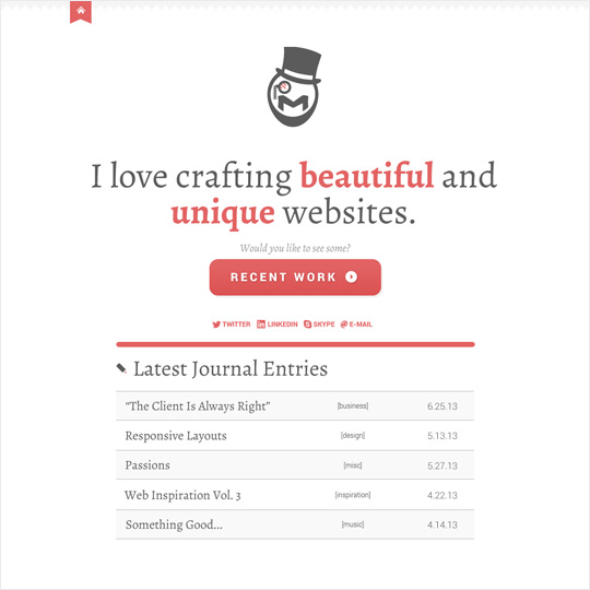
This was the second version. I was sure that I wanted a blog, and I decided that I wanted to feature the blog entries on the home page. I also started messing with the white space in the header.
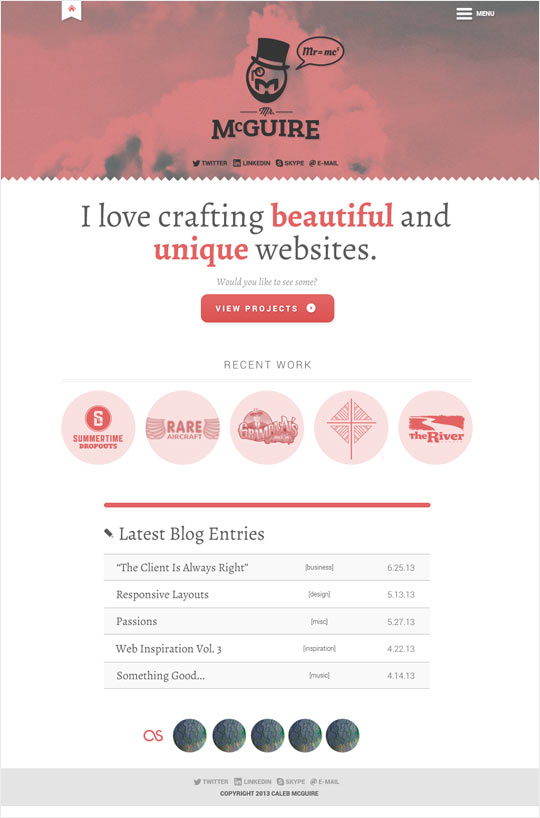
On this version, I modified quite a bit. I finished my logo, so I pulled that in. I changed the name from Journal to Blog, and I also brought in the clouds image to give the header a little more weight. In the footer I added a recent track list. I think it helps to give a more of a personal touch. I added the section to feature recent projects as well.
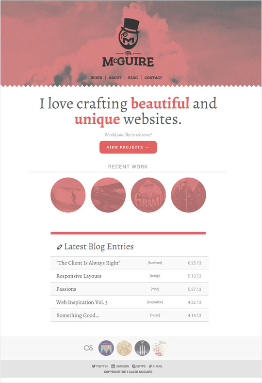
On my final round(s), I did a lot of tinkering with the navigation. The expandable “hamburger” menu wasn’t sitting well with me (har har). It looked clean and uncluttered, but I wasn’t sold on its usability. I ended up going with a more traditional navigation that was always visible. I went from 5 columns to 4 columns for the recent work section because uneven numbers were a headache with responsive design. I also took off the top left home icon. While I liked the splash of white in the header, it didn’t really make sense having them there from a usability standpoint.
So, there you have it. I would have loved to have the details with the navigation ironed out before I started the development process, but sometimes you don’t know how something will work until you see it. Overall, I’m happy with how the website turned out. It was a pretty big learning process for me and a lot of fun.